Preparing Photos For Print
Ever wonder what your digital image would look like as a print? Have you ever been unhappy with a print and wondered what could have been done for better results? From advertisements to art décor, we are exposed to print work every day. Although it can seem intimidating, prepping your image is actually easy, and you can be confident that your print will turn out as expected if you follow a few simple steps.
- Calibrate Your Monitor
- Fine Tune Your Image
- Consider Resolution
- Save Your File
- Choose Your Print Lab

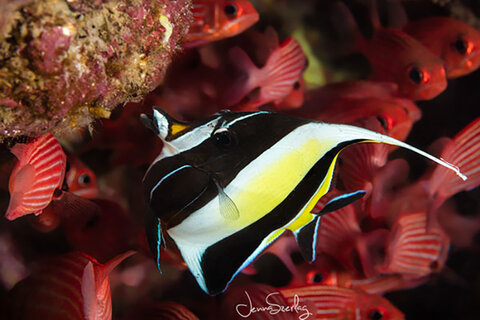
When I signed on as a contributor with a curated photo agency in 2012, refining my files to suit a wide range of applications was a learning curve. Not only has it grown my capability as a photographer but it has taught me how to retain image quality throughout my workflow. The agency I am contracted with licenses images to their clients for retail and commercial publications on my behalf and also distributes media to a multitude of global partners such as National Geographic Creative. It means that an image could potentially be used for a magazine article or printed as enormous art décor. Every file has to meet a refined industry standard to suit the variety of potential needs. Not only is subject matter and composition important, but to be considered for acceptance an image needs to be tack sharp and meet editing requirements that I’d like to share here with you.
Workflow
Since we may not know the destination of our images at the time of creating them I recommend staying organized and having a consistent workflow to retain the quality of your images. By always shooting in RAW format (if possible) and editing in the largest color space (such as ProPhoto RGB or Adobe RGB), you can create a master file to save for any future use. You can always downsize later, but it doesn’t work in reverse.
Getting To Know Your Monitor
Every step of the editing process plays an important role. It’s important to be aware that images look different on each screen they are viewed on, so dialing in your monitor is a must. By doing so, you will be able to avoid common editing mishaps with correcting white balance or pushing an edit beyond what the image can handle.
Although each one of my devices has its purpose I only edit on one particular desktop. The 4k monitor is densely supported by over a billion colors and is calibrated with the print lab. If you’re not currently using a wide-gamut monitor or are not in the market for an upgrade, familiarize yourself with your current one. You might even want to order a small test print from your lab to compare tone and detail.
Fine-Tuning Your Image
Fine tuning the details of your image can make a significant difference helping your print to pop. Slight adjustments are better than heavy editing, as over-editing can degrade the image quality causing noise, blur or other issues such as artifacts in the image. Social media posts are generally viewed very small so they can get away with stronger edits but your print, especially if large, will display all of the detail.
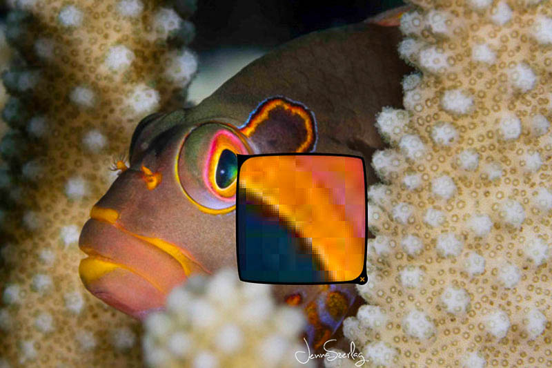
Chromatic aberration is often overlooked. This is the color “ghosting” around the transitioning edges in high contrast areas. It is caused by the way light passes through the lens glass and is more likely to occur with the use of additional wet lenses. It takes away from the overall contrast and pop and the larger an image is viewed the more apparent it becomes. Lightroom has a great tool to adjust the fringing color channels under Lens Correction > Color. While viewing your image at 100% or 1:1 check the Remove Chromatic Aberration box and slowly adjust the purple or green defringe sliders just far enough until you see the ghosting disappear. (For the latest version of Lightroom Classic CC, the defringe sliders are under Lens Correction > Manual). Adjusting too much will drive the colors into the opposite effect so slight changes are better. You can also use the eyedropper to select the affected area and have Lightroom automatically pick the settings.


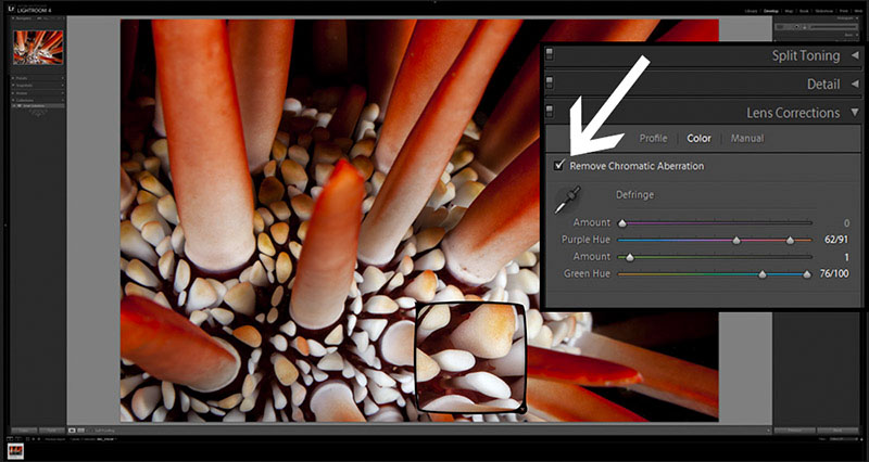
 Removing chromatic aberration in Lightroom Classic CC 2019
Noise in the image is caused by shooting with a high ISO or by certain edits, most common being aggressive lightening of dark shadows. Lightroom features a section under Detail where a luminance slider smoothes out the grain. While viewing at 100%, watch the progress closely. Be sure not to slide too far to the right as it will take away from the image detail, creating a soft focus look. If noise is only apparent in certain areas it’s best to use the brush tool and paint away the noise in just those spots. I currently prefer removing noise with the Denoise plugin by Topaz. Adding a Denoise layer prior to lightening shadows will take care of a noise issue before it appears.
Contrast sliders in Lightroom and Levels in Photoshop allow you to open up or darken the shadows and highlights if the image looks flat. Keep in mind that you will rarely need to add saturation as it builds naturally when adding contrast.
Backscatter… How many of us have caught an incredible photo where everything is in focus, the lighting is beautiful and the animal is perfectly positioned but there’s so much particle in the frame that you’re not even sure it is worth keeping? If your strobes illuminated particle in the water or even if your dslr camera sensor has dust on it you’ll want to remove the distracting spots before printing.

I prefer to use the Content Aware tool in Photoshop to remove the particles individually. It takes time but by creating your own shortcut key this process is a breeze. Check out my tutorial about using content aware fill to remove backscatter for more information. The clone tool works well but it can actually add unwanted softness around the brush edges. One touch filters are a quick, easy way to take care of a lot of backscatter at once but it might be at a cost. Filters like Dust & Scratches can create a considerable amount of blur throughout the image and are best used as a layer where you can brush away the spots in certain areas where focus is not as important. Be sure to view your image at least 1:1 or closer when editing to see if any negative effects have occurred.
Pixels vs. Max Print Size
You can print any photo, but the question is how large? Some websites will warn you when placing an order if the resolution is insufficient for the chosen size, but the labs that I work with insist it is the photographer’s responsibility. Most editing software allows you to see the resolution within the file properties, like the example from Photoshop below. The quality and size of the print you can achieve depends on this information. It is made up of the PPI or pixels per inch, the file dimensions and the file size. PPI (not to be confused with DPI which is the printer’s dots per inch) is the density of pixels within the image. High resolution is measured at 300PPI. (If the PPI is not already set at 300, you can change it but be sure to uncheck the Resample Image option first.) Dimensions refer to the width and height of the image measured in either pixels or inches. These components are the key to choosing how large of a print you can achieve.
Here’s an example of how this works. I shot the image above as RAW with the Canon 5DSR and opened it in Photoshop as a 16bit tiff. The information shows that its dimensions are 8688 x 5792 at 300PPI, which is equivalent to 28.96 inches wide x 19.307 inches high. The print guidelines provided by the popular Bay Photo lab require that for a decent 30x40 inch print the minimum resolution only needs to be a 20mb file with 2166 x 1625 pixels @ 250ppi. Check your specs before printing and if in doubt take into consideration how sharp the focus is and whether or not your file has been compressed. I envision pixels being “stretched” when creating large prints which would take away from the original pop so having incredible focus to begin with can make a significant difference.
On a side note, keep in mind your intended purpose for the print. Will it be a large fine art print for wall décor where quality is paramount? The larger a print is made the further back we view it from. Next time you are in a mall or an airport take a real close look at the quality of the photo on the banner that looked fantastic from afar. Pushing the print size isn’t always great but it depends on the intended use. Choose what works for your application and always be sure to view the image detail close up on your monitor first.
File Size Matters
Always work with the largest file size possible. Take these two images below for an example. They are both high res 300PPI 8bit files with the same pixel dimensions, but one file is an uncompressed 62mb tiff and the other is a compressed 500kb jpeg. Take a close look at the inset showing the detail at 400% zoom. Which file would you choose to print? Compression results in loss of information and greatly reduces the image quality. This alone is reason enough to shoot RAW so that the camera does not immediately compress your image when it records the file.

File Types
The type of file is just as important as the resolution and file size when it comes to printing. I am required to turn in uncompressed Adobe RGB 58-62mb 8bit tiffs at 300PPI from a full-frame sensor. In addition to this, I save the original RAW file and also my working files as layered 16bit tiffs to preserve all of the editing information to return to it at a later date if needed. When saving an image, whether automatically in-camera or after editing, compression can decrease the image quality by removing information in trade for a smaller file. This is where file types play an important role in preserving your hard work.
Shoot the largest file possible. RAW saves all of the information that the camera originally captured. It has zero compression or loss of information so all of the above edits can be extended much further than with a jpeg. RAW is the camera’s ‘language’ and needs to be converted into the computer’s language in order to be edited. RAW files also do not have a color space so you must designate one in your Photoshop and/or Lightroom settings prior to editing. A large color space such as ProPhoto RGB (or even Adobe RGB) opens up a world of color to work with. Keep in mind however that this is for print purposes; web use such as social media works within the sRGB color space. Keeping the master file aside, you can create smaller copies with less color space (like sRGB) if needed for a particular use.
The best choice to preserve the integrity of your file is to edit using ProPhoto RGB 16bit tiff files. They are very large files so keep this in mind when it comes to the capabilities of your editing system and storage space. I would also recommend using a tiff file (layers flattened) to print from if your lab accepts them.
Png is another type of lossless file, but it is optimized for graphics and generally preferred for web applications because it is smaller than a tiff (decreasing load time). Jpeg files are small, compressed files made for easy sharing via uploading, texting and social media. Because most software programs allow you to choose the compression level they can still be a fine choice for prints, as long as they are saved as maximum quality, high res files with minimum compression.
Choose Your Medium, Choose Your Lab
We have so many choices today when it comes to products and materials. From wood blocks to acrylic mounts each material boasts its own qualities and uniqueness. Canvas creates a soft, relaxing appearance and can be quite forgiving of image detail. Aluminum is striking, modern and preferred for high contrast colorful scenes. Fine Art Paper prints are gorgeous. Although more expensive since they still need to be framed, they have rich deep colors, slight texture, and a luxurious feel. I always fall in love with my images on fine art paper.
Certain materials may not reflect the detail your image has but that could also be the case with the printer as well. Labs that are advertising prints for a fraction of the cost are probably not producing a comparable product. This could be a reflection of the material used and/or within the printing process itself. Both could sacrifice the detail and tone of your image. Dye Sublimation is a process in which the image is heat pressed into the material. This quality far surpasses the less expensive outfits and is certainly something to look for if you’re after a high quality print. I always recommend talking to your lab or researching their process on their website. This video has some key bits of information and is a great visual on different types of aluminum: https://www.youtube.com/watch?v=3AQ3W3UuvP4
A print honors your vision. It cannot be manipulated or shared under someone else’s vision. It is the final creation of your work and it is incredibly gratifying being able to hold that creation in your hands.
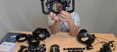
Gear Used
- Canon 5DMKII with Ikelite FL Housing (see latest Canon 5DMKIV Ikelite FL housing here)
- Canon 5DSR with Ikelite DL Housing
Both housing setups with:
- Canon EF 17-40mm F/4
- Canon EF 17-40mm f/4L USM
- Canon EF 8-15mm f/4L Fisheye USM
- Canon EF 100mm f/2.8L Macro IS USM
- Ikelite DS 160/125 Strobes
- Sea & Sea YSD2 Strobes
- Nauticam SMC-1 Super Macro Converter
RECOMMENDED ARTICLES


ABOUT THE AUTHOR

As a long-time Hawaii resident, Jenna moved to Maui in 2002 to pursue her interest in diving. Discovering the beauty of the islands and the desire to show it to the world led Jenna into her passion for nature photography. She pursued her education by attending hands-on workshops and conferences with respected educators mastering the camera topside before taking her photography underwater.
Jenna is a certified Hawaii Marine Naturalist and enjoys travel and adventure. Her images have been published in Forbes Magazine, Travel and Leisure, calendars and several other publications. She has been a professional contributor for Pacific Stock since 2012, the largest worldwide curated stock photography agency exclusive to the Hawaii and Asia Pacific Regions. You can find her images at www.jennaszerlag.com and on Instagram @seaofphotos.
SUPPORT THE UNDERWATER PHOTOGRAPHY GUIDE:
The Best Service & Prices on u/w Photo Gear
 Visit Bluewater Photo & Video for all your underwater photography and video gear. Click, or call the team at (310) 633-5052 for expert advice!
The Best Pricing, Service & Expert Advice to Book your Dive Trips
 Bluewater Travel is your full-service scuba travel agency. Let our expert advisers plan and book your next dive vacation. Run by divers, for divers.